Cherry red is a timeless color that brings warmth, richness, and character to any space. Whether you’re creating a cozy dining room, a dramatic living room, or an inviting front door, Farrow & Ball-inspired cherry red paint colors can make a bold statement while maintaining an elegant, heritage feel. From deep wine reds to vibrant berry tones, these shades pair beautifully with natural wood, brass accents, and crisp white trim.
Below are 10 cherry red paint color ideas inspired by the Farrow & Ball palette to help you find the perfect shade for your next decorating project.
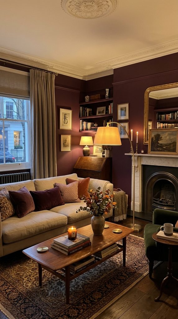
1. Brinjal – Deep Cherry Plum Red
Brinjal is a rich, dramatic shade that blends cherry red with subtle purple undertones. It creates a luxurious atmosphere in dining rooms, libraries, and cozy living spaces.
Best for:
- Accent walls
- Dining rooms
- Built-in cabinetry
Pairs well with:
- Warm white
- Brass hardware
- Dark walnut wood
2. Preference Red – Classic Heritage Cherry Red
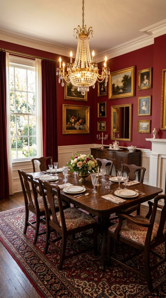
Preference Red is one of Farrow & Ball’s most iconic deep reds. Its traditional appearance works beautifully in period homes while also adding warmth to modern interiors.
Best for:
- Dining rooms
- Home offices
- Statement walls
Style Tip: Add gold-framed artwork for a timeless look.
3. Incarnadine – Bold Cherry Red
Incarnadine is a vibrant, energetic red with rich cherry undertones. It adds personality and sophistication without feeling overly bright.
Best for:
- Front doors
- Living rooms
- Feature walls
Pairs well with:
- Soft gray
- White trim
- Black accents
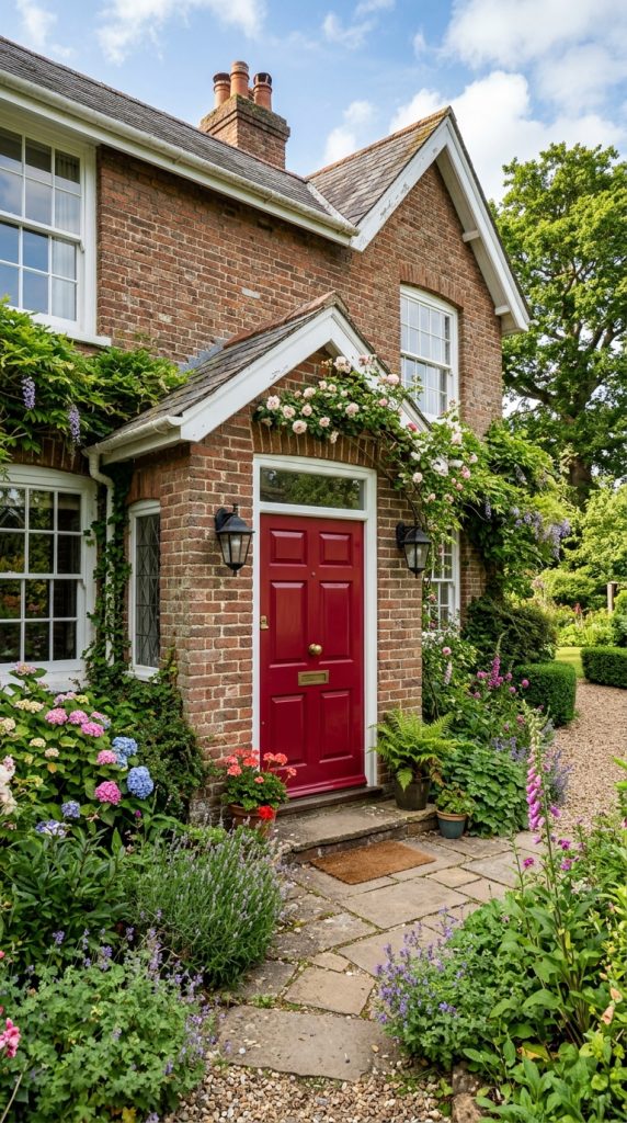
4. Eating Room Red – Warm Traditional Red
This deep, earthy red creates a welcoming atmosphere perfect for gathering spaces. Its muted tone feels elegant rather than overpowering.
Best for:
- Dining rooms
- Breakfast nooks
- Cozy sitting rooms
Perfect Pairing: Cream walls and oak furniture.
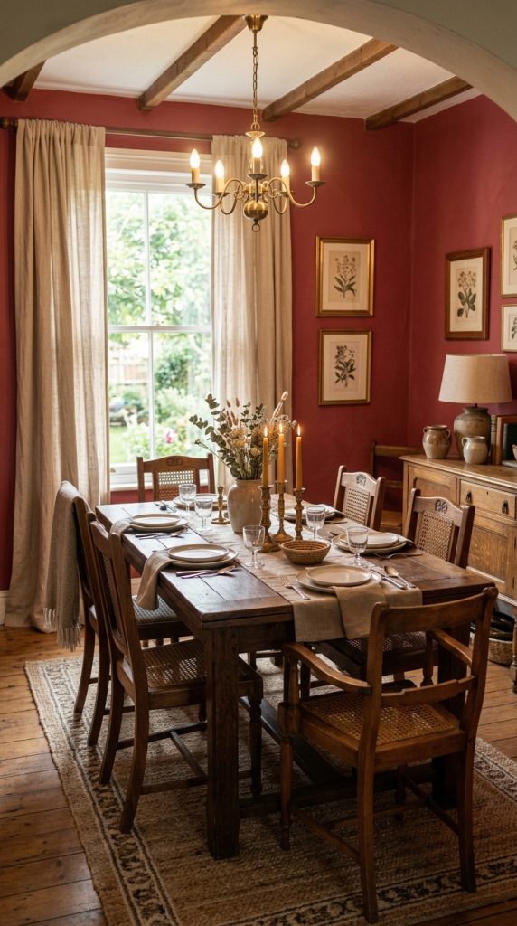
5. Rectory Red – Rich Rustic Cherry
Rectory Red combines classic cherry tones with warm brown undertones, making it ideal for farmhouse and traditional interiors.
Best for:
- Kitchen islands
- Interior doors
- Cabinets
Works beautifully with:
- Natural stone
- Linen fabrics
- Aged brass
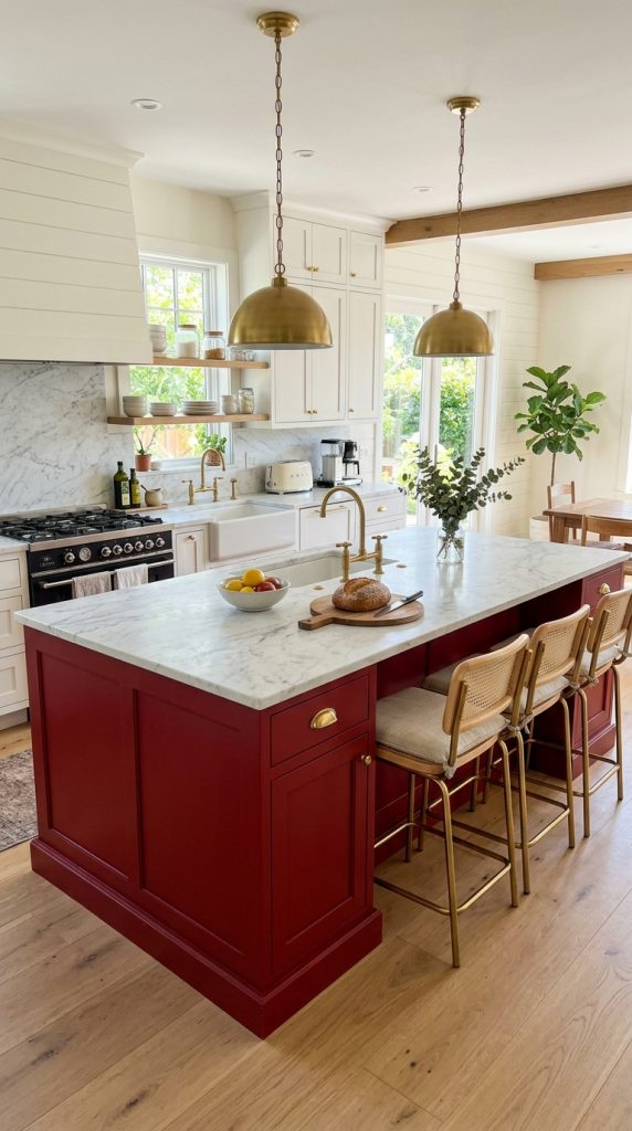
6. Picture Gallery Red – Sophisticated Statement Shade
Inspired by historic galleries, this deep red adds instant elegance to walls and architectural details.
Best for:
- Hallways
- Reading rooms
- Built-in shelving
Decor Tip: Pair with vintage décor and dark wood flooring.
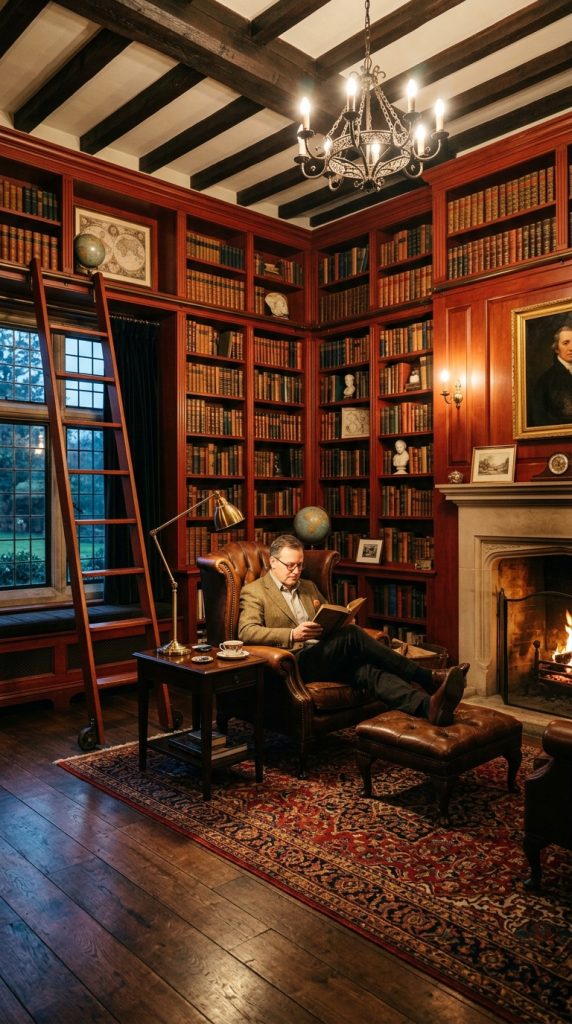
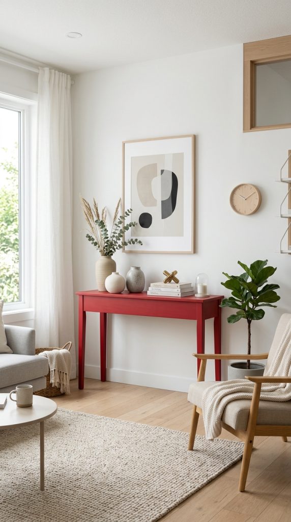
7. Bamboozle – Bright Cherry Accent
Bamboozle is a lively red with cherry-inspired vibrancy. It works well when you want to introduce bold color without overwhelming the room.
Best for:
- Accent furniture
- Children’s playrooms
- Decorative details
Pairs with:
- Soft beige
- Charcoal gray
- White walls
8. Red Earth – Earthy Cherry Tone
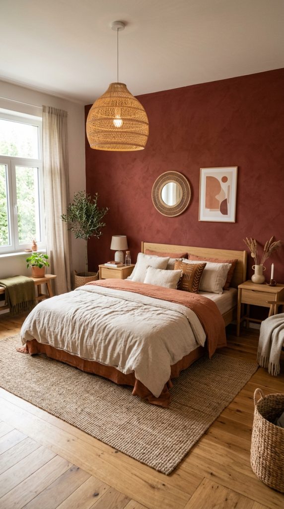
Red Earth features subtle terracotta undertones while still maintaining a warm cherry appearance. It feels grounded and natural.
Best for:
- Bedrooms
- Living rooms
- Exterior accents
Style Tip: Add woven textures and natural wood for an organic look.
9. Charlotte’s Locks – Warm Red-Orange Cherry Look
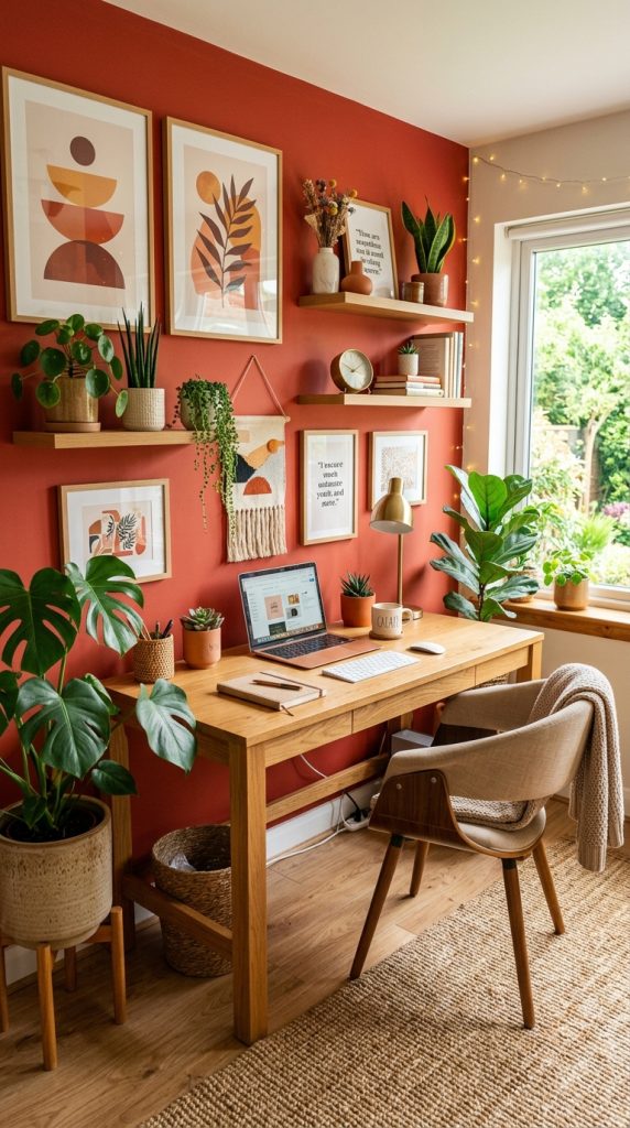
While slightly warmer than a true cherry red, Charlotte’s Locks offers vibrant energy and works beautifully in creative spaces.
Best for:
- Home offices
- Accent walls
- Furniture makeovers
Looks stunning with: Soft white and warm oak finishes.
10. Custom Cherry Red Color Combination
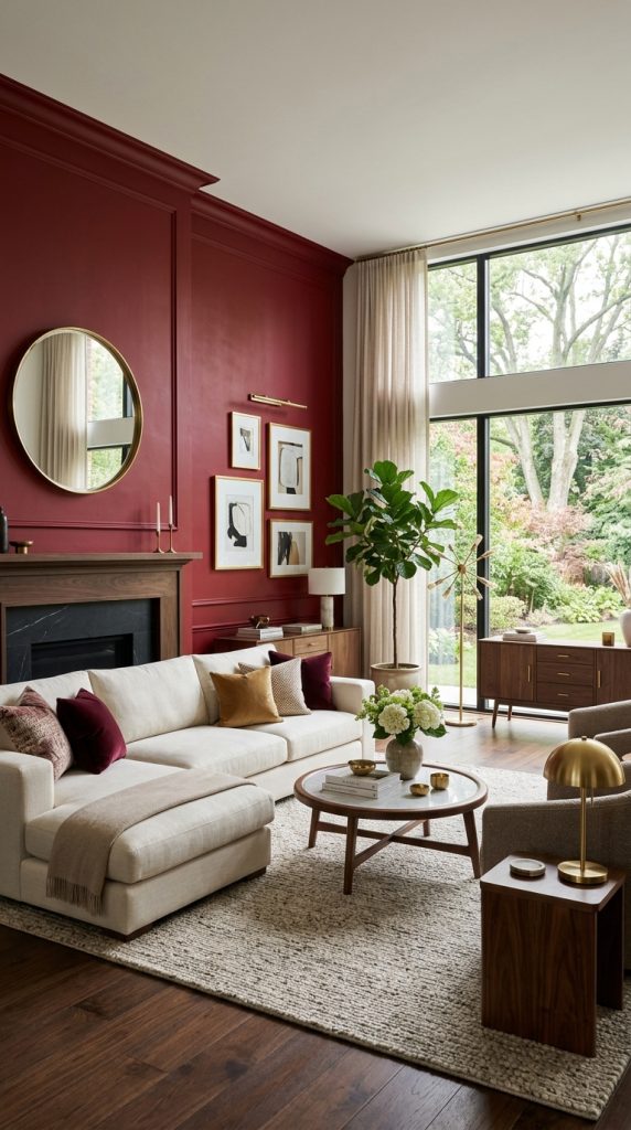
If you love the Farrow & Ball aesthetic but want something unique, combine a deep red like Preference Red with lighter neutral walls and natural textures. This layered approach creates the appearance of a custom cherry red palette that feels balanced and timeless.
Complete the look with:
- Linen curtains
- Brass lighting
- Walnut furniture
- Neutral rugs
- Green plants
How to Decorate with Cherry Red Paint
Cherry red paint works best when balanced with complementary materials and colors. Consider these styling tips:
- Use warm whites to soften bold red walls.
- Incorporate natural wood furniture for warmth.
- Add brass or gold hardware for a classic finish.
- Balance dark reds with plenty of natural light.
- Introduce greenery to create contrast and freshness.
- Use cherry red on cabinetry or doors for a subtle statement if full walls feel too bold.
Final Thoughts
Cherry red paint colors inspired by Farrow & Ball offer a perfect blend of bold character and timeless elegance. Whether you prefer the rich sophistication of Preference Red, the dramatic depth of Brinjal, or the vibrant energy of Incarnadine, these shades can transform any room into a warm and inviting space. Pair them with natural textures, neutral furnishings, and metallic accents to create a designer-inspired interior that feels both stylish and welcoming.
Leave a Reply