

Choosing the right color palette can completely change the mood and appearance of a home. A well-balanced combination of wall colors, furniture, textiles, and decorative accents can make a room feel cozy, elegant, fresh, modern, or dramatic.
Whether you prefer neutral interiors or richer colors, these 10 home decor color palette ideas can help you create a cohesive and stylish home.
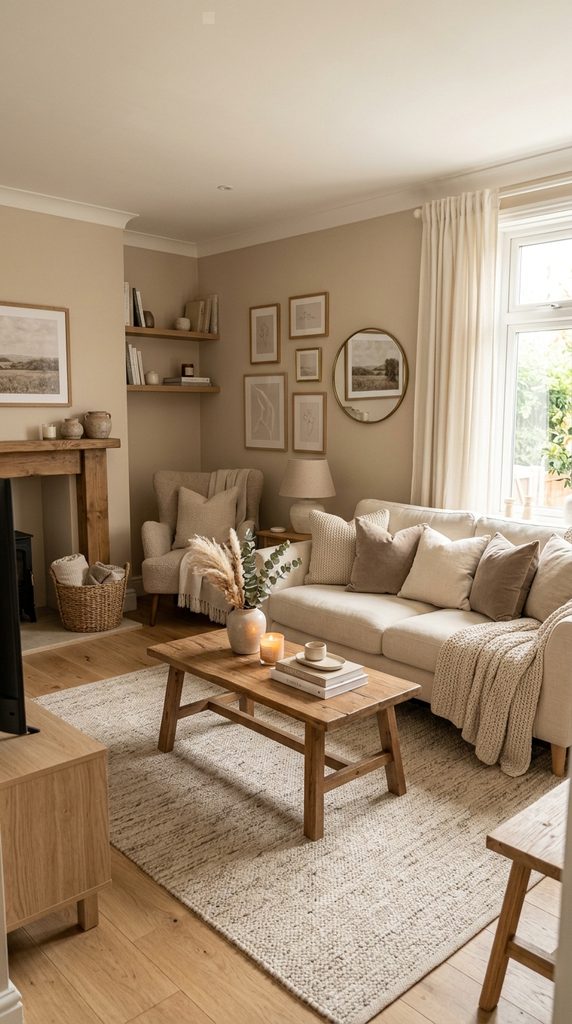
1. Warm Beige and Cream Palette
A combination of beige, cream, ivory, and light brown creates a soft and welcoming atmosphere. This palette works beautifully in living rooms, bedrooms, and dining spaces.
Pair cream walls with beige furniture, light wood, and warm white textiles. Add subtle brown accents through baskets, frames, or cushions.
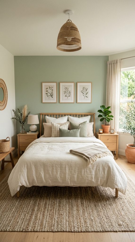
2. Sage Green and Warm White
Sage green is a calming color that works particularly well with natural materials. Combine sage walls or accent furniture with warm white, cream, and light wood.
Add indoor plants and woven accessories to reinforce the nature-inspired feeling.
This palette is ideal for bedrooms, living rooms, kitchens, and home offices.
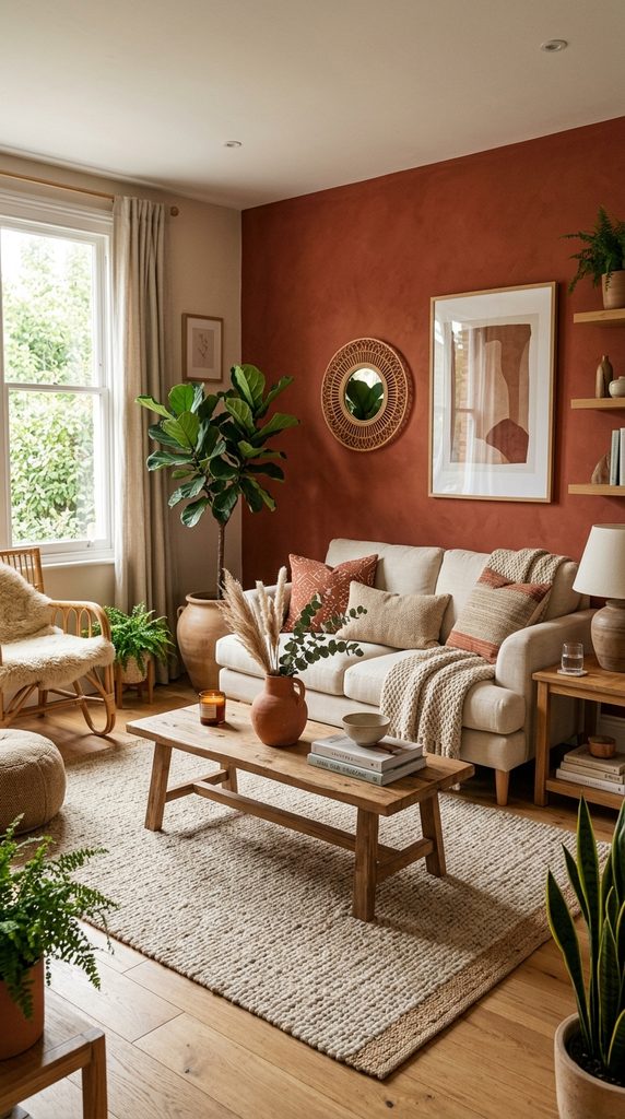
3. Terracotta and Beige
For a warm earthy aesthetic, combine terracotta with beige, cream, and natural brown.
Use terracotta through cushions, artwork, rugs, ceramics, or an accent wall rather than applying it everywhere.
Natural wood furniture and greenery can balance the warmth of the palette.
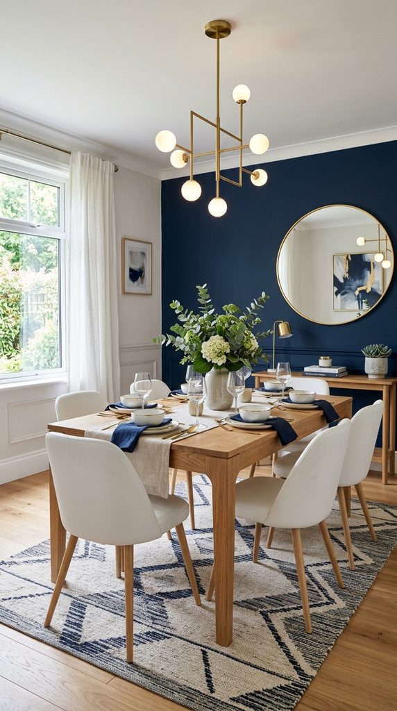
4. Navy Blue and Soft White
Navy blue creates a sophisticated contrast when paired with soft white. Use navy for an accent wall, sofa, curtains, or decorative accessories.
Keep larger surrounding areas light with white, ivory, or pale gray. Brass or warm wood accents can add additional warmth.
This combination works especially well in living rooms, dining rooms, and bedrooms.
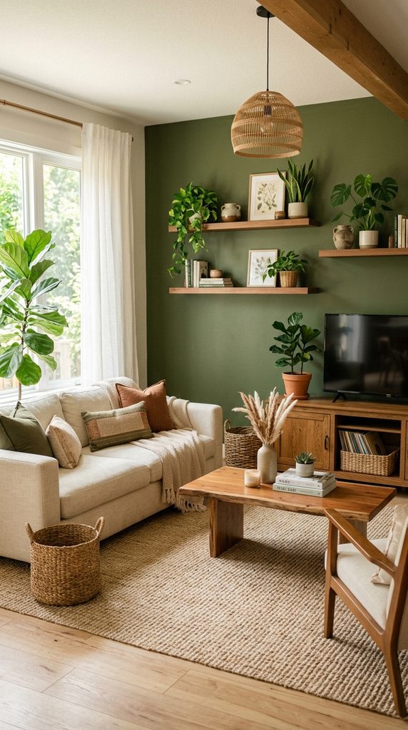
5. Olive Green and Natural Wood
Olive green pairs beautifully with natural wood tones. Use olive through walls, accent chairs, cushions, curtains, or artwork.
Combine it with beige, cream, and medium-toned wood for a relaxed organic interior.
Add plants and woven materials to enhance the natural atmosphere.
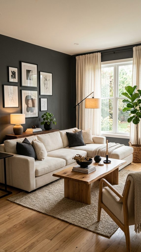
6. Charcoal, Cream, and Wood
Create a modern and sophisticated interior with charcoal, cream, and warm wood. Use charcoal as an accent rather than overwhelming the entire room.
A cream sofa, wooden coffee table, charcoal artwork, and warm lighting can create a balanced look.
This palette is especially attractive for contemporary living rooms and dining areas.
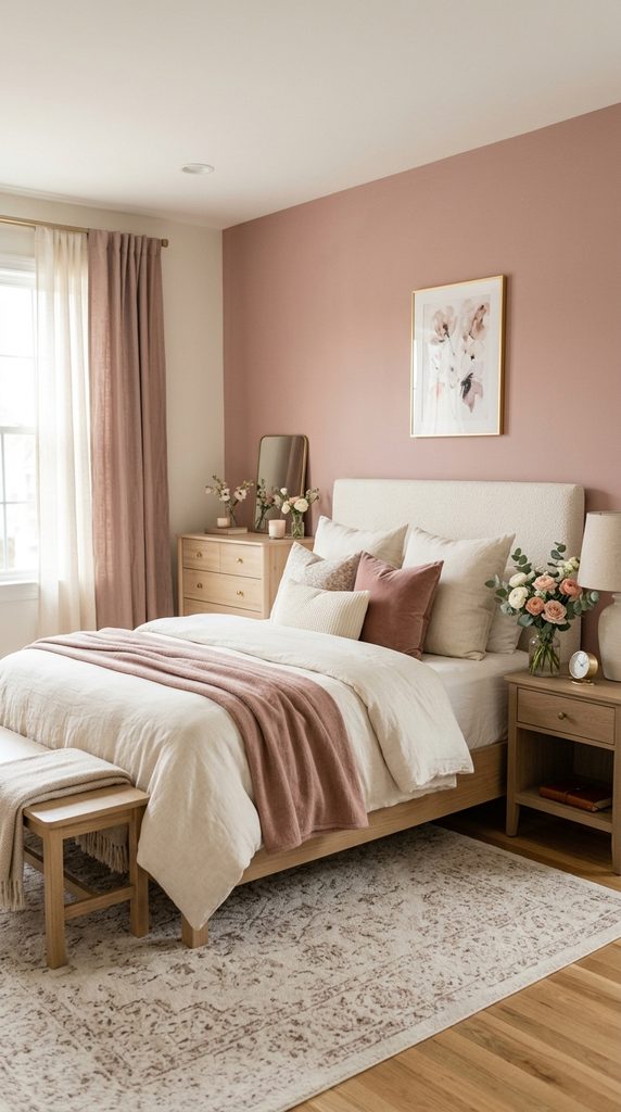
7. Dusty Rose and Ivory
Dusty rose can add softness without becoming overly bright. Combine it with ivory, warm beige, light wood, and muted brown.
Use dusty rose in cushions, bedding, curtains, artwork, or small furniture pieces.
This palette works particularly well in bedrooms and soft, romantic interiors.
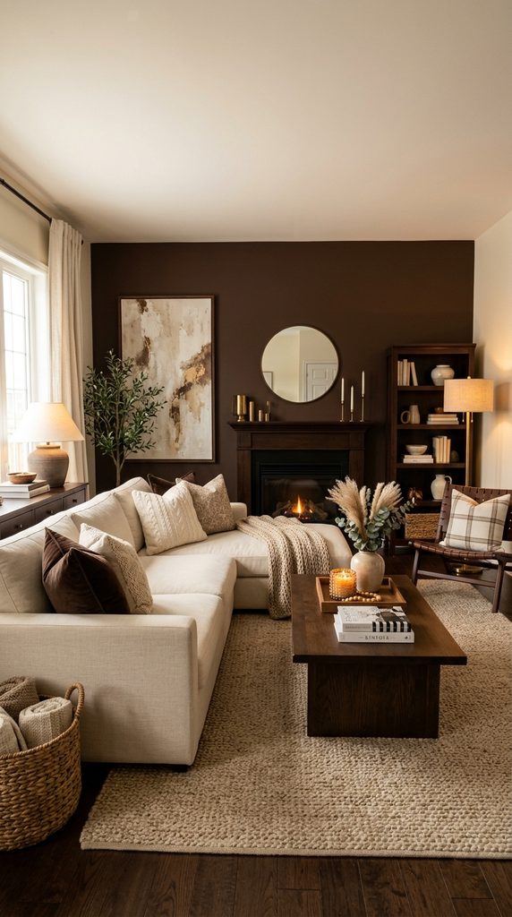
8. Chocolate Brown and Cream
Chocolate brown creates a warm and luxurious feeling when paired with cream. Introduce brown through wooden furniture, leather seating, rugs, or accent walls.
Use cream and ivory for larger surfaces to prevent the room from becoming too dark.
Warm lighting can make this combination particularly cozy in the evening.
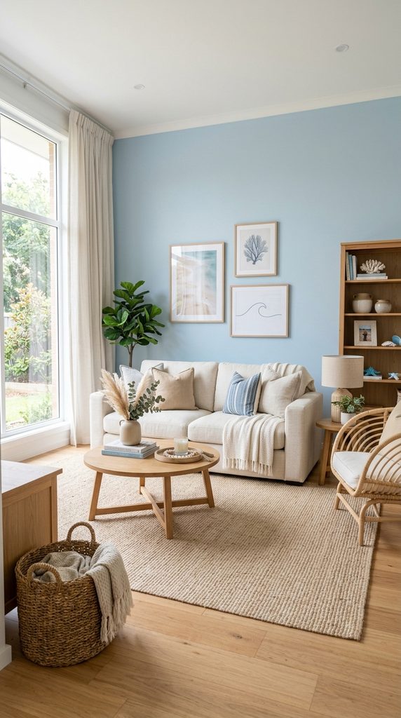
9. Sky Blue and Sand
For a light and refreshing atmosphere, combine soft sky blue with sandy beige, cream, and natural wood.
Use blue through cushions, artwork, curtains, or an accent wall. Keep larger furniture pieces neutral.
This palette can create a relaxed coastal-inspired feeling without relying heavily on themed decorations.
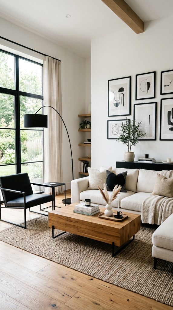
10. Black, White, and Natural Wood
A classic black-and-white palette becomes warmer when natural wood is added. Use white as the dominant background, black for contrast, and wood for warmth.
Black can appear through lighting, frames, furniture, or small decorative accents.
This combination works well in modern, minimalist, and contemporary interiors.
How to Choose a Home Decor Color Palette
Start with a dominant color, such as cream, beige, white, or another neutral. Then choose a secondary color and one or two accent shades.
A simple 60-30-10 approach can help create balance: approximately 60% dominant color, 30% secondary color, and 10% accent color.
Consider natural lighting before choosing wall colors. A shade can look different depending on the direction and amount of sunlight in a room.
Finally, repeat your chosen colors throughout the space using furniture, rugs, curtains, cushions, artwork, and accessories. Repetition helps the entire room feel connected.
Final Thoughts
These home decor color palette ideas offer a starting point for creating a cohesive and attractive interior. Warm neutrals provide timeless comfort, greens bring a natural feeling, blues add calm sophistication, while earthy tones create warmth and character.
The best palette is one that complements your home’s lighting, furniture, and personal style. Start with a few colors, test how they look together, and build the room gradually.
Leave a Reply